
I used to think my friend Mia’s job as a game UX researcher was just “getting paid to play games and complain.” I’d tease her: “Oh, so you tell devs ‘this button is ugly’ and call it work?” She shut me down fast—invited me to sit in on a usability test for a new platformer. There, I watched a teen stare at the screen for 5 minutes, panicking, because he couldn’t find the “jump” button. Mia didn’t just say “fix the button”—she pulled up eye-tracking data showing his gaze kept darting to the bottom right (where the button should be, not where it was). “UX isn’t about ‘I don’t like this,’” she said later. “It’s about ‘here’s why 80% of players quit at level 2—and how to stop it.’” That’s the big myth: Game UX isn’t subjective. It’s science—proving what “fun” actually looks like, one test, one eye movement, one interview at a time.
Let’s start with usability testing—the “watch people fail (so they don’t fail later)” part. Mia’s team invites players of all skill levels: newbies who’ve never held a controller, casual gamers who play 30 minutes a night, and pros who grind ranked. Last month, they tested a RPG’s tutorial: 6 out of 10 players forgot how to open their inventory because the prompt was white text on a light background. “We didn’t just say ‘make the text darker,’” Mia explained. “We had players talk aloud while they played—one said, ‘I thought that was just a decoration!’ So we added a tiny animation to the inventory icon, and suddenly 9 out of 10 found it.” Usability testing isn’t about shaming players for “not getting it”—it’s about shaming the game for not explaining it. Mia once had a dev argue, “The button is obvious!” Then he watched a grandma click every part of the screen except the “start” button. “He changed the button color by the end of the day,” she laughed.
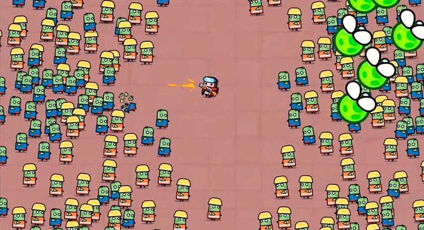
Eye tracking is where things get weirdly fascinating—like reading a player’s mind without them knowing. Mia showed me a heatmap from a strategy game: players kept missing a critical “defend base” button because it was next to a flashy “attack” button. The eye-tracking data? Bright red on “attack,” barely any color on “defend.” “Devs wanted the attack button to pop—but they made it so pop that players forgot to defend,” she said. They moved the defend button to the left, added a subtle glow, and suddenly players started using it. Another time, eye tracking revealed that players in a racing game were ignoring the minimap—because it was too small and placed in the corner. Mia’s team resized it and moved it to the top center, and crash rates dropped 30%. It’s not magic—it’s watching where players actually look, not where devs think they’ll look.
Then there are the user interviews—the “let’s talk about why you wanted to throw your controller” part. Mia doesn’t just ask “did you like it?” She asks, “What made you want to stop playing?” Last year, she interviewed 50 people about a survival game, and 40 said they quit because the difficulty spiked too hard at day 5. “Devs thought ‘harder = more fun,’ but players said ‘harder = I’m wasting my time,’” she said. The team adjusted the curve—slower difficulty growth, plus a “help” item spawn at day 4—and retention doubled. Interviews also catch the small stuff: one player mentioned the game’s background music made them anxious (it was too loud, with too many high notes). Mia’s team added a “relaxed audio” mode, and suddenly more players said they’d play for hours instead of 30 minutes. “UX is about the details no one else notices,” she said. “The music, the button size, the way the tutorial talks to you—it all adds up to ‘fun’ or ‘flop.’”
Here’s the tea: You never notice good UX—you only notice bad UX. When a game’s tutorial flows, when buttons are where you expect, when difficulty feels “just right”? That’s Mia and her team’s work. When you quit a game because you’re confused or frustrated? That's the UX that failed. Mia once worked on a mobile game that was tanking—until her team found out 70% of players couldn’t figure out how to save. They added a big “save” icon with a pulse animation, and downloads jumped 50%. “Devs thought they’d made a ‘hardcore’ game,” she said. “Turns out they’d made a ‘confusing’ game.”
Next time you play a game and think, “This just works,” take a second to thank a UX researcher. They’re the ones who sat through hours of people struggling, analyzed eye-tracking data until their eyes crossed, and asked the tough questions to make sure the game feels fun—not frustrating. Mia sums it up best: “Fun isn’t a feeling. It’s when a game respects your time, explains itself clearly, and meets you where you are. And that? We can prove it.”
Disclaimer: Mention of any brand or trademark is for identification only and does not imply partnership or endorsement